Launch Image
When to use it
Visual Cues
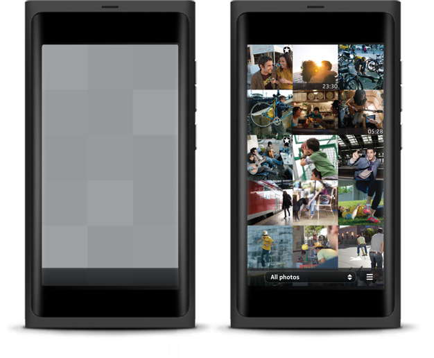
Typically, when applications take a bit of extra time to load, a launch image should be used to transition a user onto the landing page. This launch image provides visual feedback that something is happening, reassuring the user and making the load time seem shorter. The launch image is a skeleton of the landing page, and it lacks any real information. However, in certain cases, you can embellish the launch image to show impressions of the layout. Please note: A launch image is not meant to replace the splash screen.
Launch progress
1 - The user launches the application.
2 - In less than 100ms, a launch image is loaded into memory. JPEGs should be used for graphically complex images and PNGs for more basic images (e.g. black and white images).
3 - Once the image has loaded into memory, the usual app launching motion should kick in within 300ms, and the image should appear on the screen. Swipe behaviours and dialogues will work at this point.
4 - The user should not have to wait for more than 400ms for the actual landing page to load. When ready, the landing page should crossfade in, taking no more than 250ms to load.
How to use it
Blank empty states
Any entry point into an application can have its own launch image. For example, an application such as Twitter might have a launch image for the main view, composition view, profile pages, and an individual tweet. Essentially, a launch image can apply to any deep link view. Conversely, an application such as the calculator or a browser can only have one launch image.
Last used state
If the application supports state saving, then the application can generate and replace the image(s) that are loaded at launch.
First launch state
If an application has a specific first run screen, then that should be used.
Basic rules for launch images
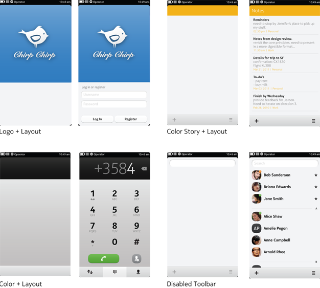
- Maintain the structure of the application and respect the layout.
- Ensure iconic elements remain intact and avoid purely black, grey or white images. If required, you can add subtle elements to communicate your application's iconic state (see gallery example).
- Use an empty state.
- Remove all content from the view.
- Remove any calls to action.
- Make sure any buttons left on the toolbar appear disabled.
- Do not assign icons or highlights to tabs.
- Remove localisable strings.
- Remove any elements that crossfade badly.