Navigation Structures
Overview
The way your users move between your application's main sections or modes is at the core of your application's user experience. We recommend that before starting your development project, you give careful consideration to the type of main navigation structure that will be most appropriate for your application.
On this page, you'll find a description of the most popular navigation structures. These offer you a starting point and direction for designing your application's navigation structure.
Tab Bar Navigation
Usage
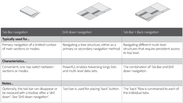
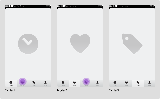
The tab bar is typically used on the bottom of the screen and provides quick access between distinct areas or modes. You should use this model for applications with a limited and stable set of main sections or modes.
Tab bar contents
The tab bar should only display navigation options (up to a maximum of five) for distinct application modes or views. Never add the Action Menu or actions (such as "Create New Message") to the bar. Instead, create buttons within the Content area to accommodate these actions. Additionally, navigation options in an application should not change over time, so do not use them to accommodate newly installed extensions.
Tabs are sticky
When navigating between tabs, the most recently accessed view of each tab is stored and presented when a user returns to the tab. Also, actions taken in these views are not cleared when navigating between tabs. Examples are Search and a log in form: A search result is not erased and the user is not logged out.
Additionally, keep the following rules and considerations in mind:- When the user launches your application, you can set your application to open in its most recent navigation state or to always open to a particular tab.
- The selected tab is always highlighted throughout the journey to help support the user.
- Tapping on the selected tab takes the user to the top level of the current tab.
Drill Down Navigation
Usage
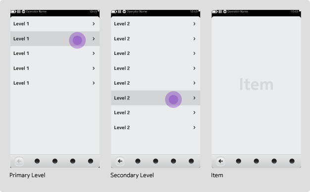
The Drill Down navigation model provides access to an application's full navigation structure at the top level. It allows a user to find a desired content item by navigating down the hierarchy of the application's information structure via categories. As the user moves down the structure, a Back button becomes available that facilitates navigation to the previous level.
Layouts are not restricted to lists
While Drill Downs may imply a certain information structure of the application, they do not restrict or limit the layout of the application. Common layouts include list view, grid view or a combination of the two in a split view.
Categories and content items are not mutually exclusive
Categories and content items may coexist at any given level of the hierarchy. Bearing this in mind, you might want to consider differentiating between the two, as they may yield different results when pressed. More specifically, since categories drill down further into the hierarchy while content items open a detail view, differentiating these through a visual treatment or grouping may better meet user expectations.
Tab Bar + Back Navigation
Usage
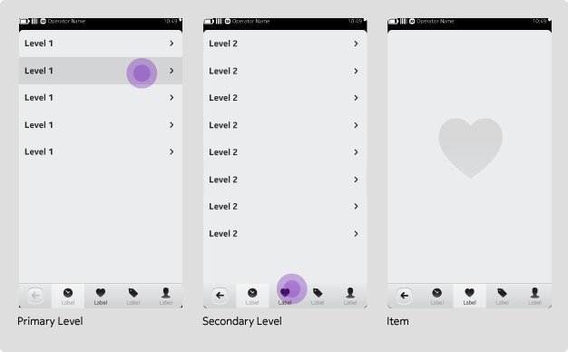
For more complex structures with multi-level information hierarchies requiring persistent access to top-level navigation, it may be necessary to combine Drill Down and Tab bar functionality.
Persistent 'back' button
This model leverages the simple main navigation of the Tab bar model, but it introduces a dedicated and persistent space for a Back button. Consequently, only four tabs are available.
Always maintain the Back button behaviour throughout the application experience to reinforce consistency and eliminate confusion. When Back is not available (i.e. in top level views), simply use its inactive state.
Back is historical within a tab
The Back button navigates historically within the selected tab and should not be used to navigate across tabs.
Downloads
Resources