Guiding Principles

Big experience, small screen
“I want my smartphone to fit in my pocket.”
To maximise screen real estate on our phones, we've replaced dedicated hardware and software buttons with simple gesture-based navigation.
“I want to use my smartphone with one hand.”
People don't always have both hands free when using their phones. That's why we've ensured ours are easy to hold and support swiping gestures that lend themselves to use with one hand, even one finger.
Effortless journeys with simple interactions
“I want to move around my phone quickly and easily.”
Nokia N9's natural swipe gesture works from any edge of the screen and gives people a consistent way to move between their apps and the Home screen.
“I want to do more than one thing at a time.”
Jumping between apps becomes seamless with Nokia N9's 'Open Applications' view on the Home screen that puts recently accessed content at people's fingertips.
“I want visual cues to guide me.”
By color-coordinating apps across the different home screens, we've ensured people always know where they are. The cyan color for Messaging is repeated in the app icon, event feed, open applications thumbnail, and full app.
Meaningful messaging
“I want quick access to important messages.”
Active messages and events play a key role in the Nokia N9 UI. That's why we've made notifications accessible at any time, even from the lock screen.
“I want to see all my messages in one place.”
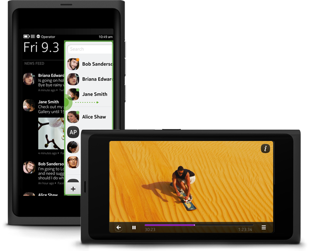
The Home screen's events view streamlines the way people follow and manage their social media channels. Now they can create a customoloured view that delivers a combined feed for all incoming messages, notifications and posts.
“I want better feeds.”
The Nokia N9 UI lets people quickly scan the latest messages and updates from their favorite feeds without having to open several different apps.
A better home
“I want a home space that gives me more when I need it.”
By offering a choice of views ranging from simple to sophisticated (Events, Applications, Open Applications), we've given people three different views on their apps to help them find what they need, when they need it.
“I want it to be easy to get ‘home’ quickly.”
The Home screen in Nokia N9's UI serves as the cornerstone for all the experiences people will have with their phones. Its simple, flat UI ensures people can get 'home' with a quick swipe.