Dialogues & Menus
The framework offers different types of dialogues and menus that enable the user to respond or provide more input. Each type has its own purpose and is typically used in a different context.
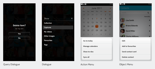
- Query Dialogue - A single question or alert from the system or application
- Generic Dialogue - A set of actions, options or verbs typically triggered on tap
- Action Menu - A set of actions, options or verbs specifically related to the current view
- Object Menu - A set of actions, options or verbs related to the object, triggered on long press
- View Filter - A dialogue used for filtering content
Order of options
In general, positive options appear top / right, while negative options appear bottom / left. Also, we recommend that the Object Menu, Dialogue and Action Menu present their options in the following order:
- Primary actions (e.g. Call, View, Play)
- Secondary actions (e.g. Send Message, Set as Wallpaper)
- When relevant, Share
- Negative actions (e.g. Delete, Remove, Unsubscribe)
Swipe behaviour
Swiping between apps behaves normally regardless of open dialogues and menus. If returning to the Open Applications view, they will be displayed in the app window. For individual dialogue and menu dismissal rules, see below.
Query Dialogue
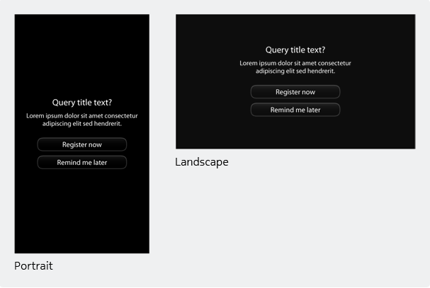
Query dialogues are blocking views and interrupt the user's current task by displaying critical and time-sensitive events that require an immediate response. They are typically used for notifying the user or requesting confirmation (e.g. when deleting a photo from the gallery).
Basic rules for Query Dialogues
- Always show 'QueryTitle'
- Use additional text and/or icon if needed
- Offer up to 3 actions/buttons
- For Query Dialogues with 2 or more actions, buttons are always grouped vertically
- The primary action is always listed first
- Users must tap a button to dismiss the dialogue
Generic Dialogue
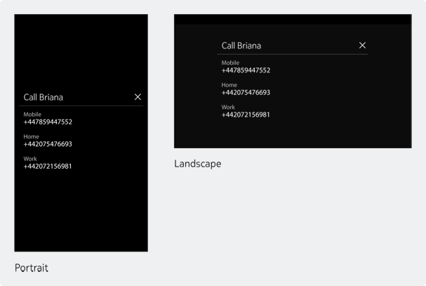
Generic Dialogues are modal overlays that display multiple actions or options. They are used when an object or control has multiple actions or options associated with it. For example, if there are multiple phone numbers associated with a single contact, tapping on the contact from the Phone application's picker brings up the Generic Dialogue listing all the associated numbers. Tapping on a number proceeds to dial that number.
Basic rules for Generic Dialogues
- They always contain a title row and close button.
- A title row must not exceed one line.
- Content rows can contain two lines.
- An avatar or icon can be shown in the title and/or content rows.
- Used for single and multiple tap interactions and should not contain components that require more complex interactions (e.g. sliders, switches, etc.). If those components are needed, then a sheet should be used instead.
- Not used to show progress.
- Tap the 'X' button to close the generic dialogue.
Action Menu
The Action Menu is a standard component that can be included as the right-most item of the Tool Bar. It contains a set of actions or options related specifically to the current view. Tapping the icon opens/closes the Action Menu. A distinct Action Menu can be provided for each view of the application.
For primary and frequently used actions, consider placing them either in the Tool Bar or in the content itself.
Basic rules for Action Menus
- Single column only (in either orientation) and may contain between 2-5 options. Each option in the menu typically starts with a verb (e.g. Delete items).
- Not used for navigating to other sections of the application (e.g. to go to 'Settings') or for hiding the application (since the 'Swipe' gesture handles this).
- Should enable simple 'one-click' interactions and not spawn other options, menus or dialogues. A rare exception to this rule would be if a user were about to perform an irreversible deletion. In this case, you could spawn a dialogue asking for confirmation.
- The user can tap an available action, the action menu icon, or the empty space above the menu to dismiss the action menu.
Language for Action Menus
The list of basic prompts in Action Menus gives users a choice of several actions. As such, each one needs to be short, crisp and clear, but, where possible, also human. The humanity comes through in the choice of everyday words. For example:
Don't Use: "Enter name"
Use: "Add name"
Don't Use: "Display email"
Use: "Show email"
The preferred format is two words, made up of a verb and the object (e.g. Delete contact, Edit tags, Import contacts etc). However, there may be cases where the verb is phrasal and made up of two words (e.g. Go to, Look up, Set up) or the object needs two words to describe it (e.g. more contacts, mail account, user name). In such cases, three (preferably short) words are acceptable.
Use: "Open mail account"
Use: "Look up contact"
There are also cases where there may be more than one object (such as photos, videos and wallpapers in the Gallery). Each case needs to be taken on its own merits, and combining two short words is acceptable.
Use: "Save video"
However, anything longer needs a one-word collective description — 'files' where possible (but try to avoid the word 'items').
Use: "Delete files?"
If you are on a specific action screen where the object is already clearly defined, there's no need to repeat the name of the object in the command. If the user is in photos, for example:
Don't Use: "Edit photo"
Use: "Edit"
Don't Use: "Add photo as wallpaper"
Use: "Add as wallpaper"
The exception to this is when there's room for confusion. For example:
Use: "Edit tags"
Use: "Edit photo"
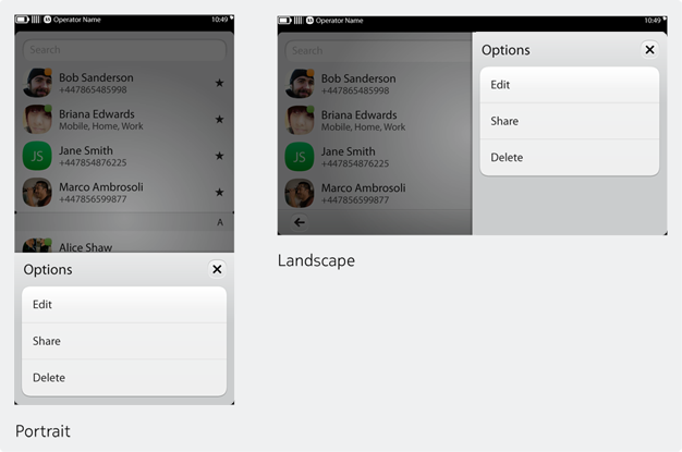
Object Menu
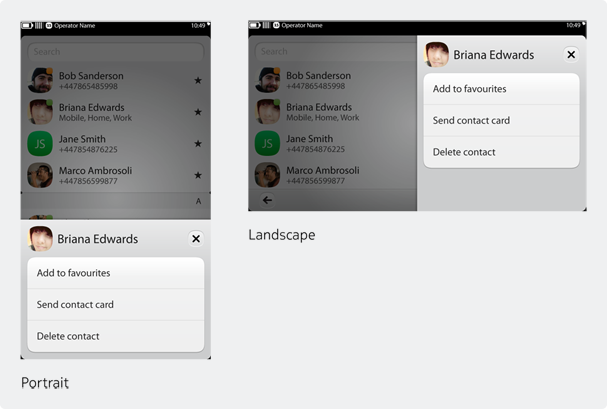
The Object Menu is accessed via a long press on an object and provides an overlay menu with actions directly related to that object.
Basic rules for Object Menus
- Not all users will know about long press actions, so do not use the Object Menu as the only place for an action but rather as a shortcut.
- While optional, we recommend that you display an object's title, supplemented with a thumbnail or an icon when appropriate. This will help maintain the menu's context.
- As a rule, limit the menu to at least 2 and no more than 5 options. The options available will depend on the object. For example, the People Object Menu includes "Edit", "Add to favorites", "Send" and "Delete", while the Song Object Menu includes "Set as Ringtone" and "Share".
- Do not duplicate the primary action. For example, if an item on the UI opens with a tap, do not place an option for opening the item in the Object Menu.
- If possible, reposition the view so that the object is still visible in the background while the Object Menu is displayed.
- A user can close the Object Menu by selecting an action or by tapping the area outside it.
Language for Object Menus
Here, the object is often already defined because the user will already be in that particular section. As a result, most of the time you will only really need the verb as a prompt. For example, if you're in the Messages menu, you'd just need to use Save, Delete, Forward, and so on.
However, there may be times when you need to be more specific to guide the user. For example: in Contacts, you might need an instruction such as "Add to favorites" or "Send text message"; in Music, you might need an instruction such as "Add to queue" or "See details".
View Filter
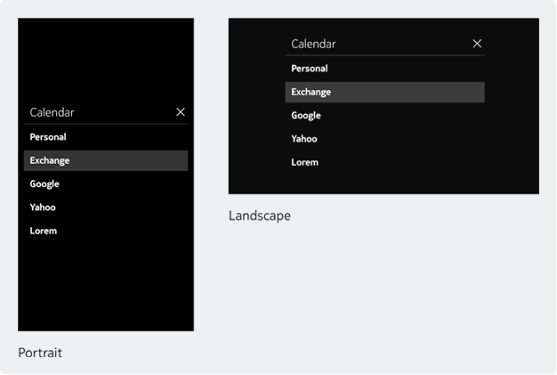
In the first release of Nokia N9, the view filter will not be a unique component. Rather, the generic dialogue will be used for filtering content.