Labels
There are two types of labels: Simple and rich. Their application and usage are described and illustrated below.
Simple labels
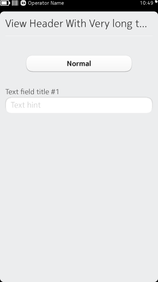
Simple label examples
Simple labels should be used inside UI components such as buttons, header rows, titles or 'View menu' text where only one line of text is required without any special formatting.
Basic rules for Simple labels:
- Used for plain text on one line (e.g. device buttons)
- Does not wrap – if the label is too long, truncate it and add an ellipses "..." at the end of the label (a label must be at least 4 characters long to be eligible for truncation)
- Does not support any special interactions
Rich labels
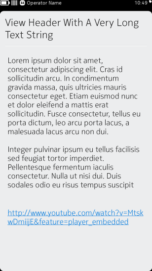
Rich label examples
Rich labels, on the other hand, support text formatting (e.g. bold or color) and wrapping rules. They should be used for long UI copy. They can also include links for more sophisticated interactions, including links to phone numbers, GPS locations, URLs and even other parts of the Nokia N9 UI.
Basic rules for Rich labels:
- Extends the behaviour of the label
- Used when text styling and formatting is desirable
- Can contain paragraphs (one or multiple lines with wrapping)
- Comes from separate graphical files (.css)
- Supports HTML tags for text formatting (e.g. bold, italics, color, etc)
- Supports highlighting for links and searchers