Experimenting with the Listview
What if we need to display a list of items on the screen? Looks like there is a QML element just for that purpose, it is called the Listview.
The Listview element is typically used in a so called Model-View framework. The idea is to keep the data (=model) we want to display decoupled from the view we see on the screen. This makes is very easy to change the display layout (could be a list, table, tree, etc) as we don’t need to change our model data structure. To accomplish this we just need to have a standard interface between our model part and our view part so that the view logic does not depend on the model implementation.
A typical ListView element contains two main properties: model and delegate, here is an example:
ListView {
    id: listView
    model: listModel
    delegate: listDelegate
}
The model property points to our data model and the delegate property points to a QML component used to display each list item (formatting the data). So, how do we access the data in our model? The Listview element is quite flexible, for simple data structures the ListView contains a variable called modelData that returns the items from the model. For more complex data structures we can define so called roles that we attach to the different kinds of data in our model. Then in the view part we can refer to the data items by specifying the role name.
Let’s start with a very simple example. To make this a bit more interesting let’s take some smiley icons from the theme folder and list the icon names in our Listview. If the icon name is clicked we will open a new page and display the icon image.
We can store the icon names into a property in our main.qml file:
property string iconNames: "angry;cool;cry;evil;grin;happy"
Then in our ListView element we can create a string list to be used as our data model:
model: iconNames.split(";")
Then we just need to create a delegate component that formats the list elements and checks if the list item is clicked. When the Listview element is displayed it will fetch each item from our string list and return the element in the modelData variable. Then the item will be displayed using the delegate component.
Note that we have put a MouseArea element inside the Text element so that it covers the whole text area (with anchors.fill). When the item is clicked the iconPage is pushed into the page stack and displayed. The left margin is taken from another property (called leftMargin). Finally the icon name from the modelData is stored into yet another property to be used in the icon page.
    Component {
        id: listDelegate
        Text {
            text: modelData
            font.pixelSize: 40
            color: "steelblue"
            anchors.left: parent.left; anchors.leftMargin: leftMargin
            MouseArea {
                anchors.fill: parent
                onClicked: {
                    iconSelected=modelData
                    pageStack.push(iconPage)
                }
            }
        }
    }
Here is the main.qml file. The properties are defined first. Then the pages are declared (listPage and iconPage). The common toolbar and the menu element are the default ones from the Qt Quick App template. We need to initialize the iconSelected property with a valid icon name as the iconPage will be created before anything is selected.
import QtQuick 1.1
import com.nokia.meego 1.0

PageStackWindow {
    id: appWindow

    property string iconPrefix: "icon-m-messaging-smiley-"
    property string iconNames: "angry;cool;cry;evil;grin;happy;heart;kiss;lips-sealed;sad;sarcastic;skeptical;sleepy;surprised;tongue;very-happy;wink;worried"
    property string iconSelected: "angry"
    property int leftMargin: 32

    initialPage: listPage

    ListPage {
        id: listPage
    }

    IconPage {
        id: iconPage
    }

    ToolBarLayout {
        id: commonTools
        visible: true
        ToolIcon {
            platformIconId: "toolbar-view-menu"
            anchors.right: (parent === undefined) ? undefined : parent.right
            onClicked: (myMenu.status === DialogStatus.Closed) ? myMenu.open() : myMenu.close()
        }
    }

    Menu {
        id: myMenu
        visualParent: pageStack
        MenuLayout {
            MenuItem { text: qsTr("Sample menu item") }
        }
    }
}
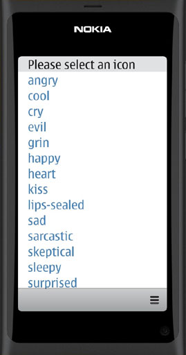
The ListPage.qml defines the ListView and the delegate component. A simple rectangle is used as the list background. A title is put to the top of the page.
import QtQuick 1.1
import com.nokia.meego 1.0

Page {

    tools: commonTools

    Label {
        id:title
        text: "Please select an icon"
        font.pixelSize: 40
        anchors.left: parent.left; anchors.leftMargin: leftMargin
    }

    Rectangle {
        id: background
        anchors.top: title.bottom
        height: parent.height-title.height;
        width: parent.width
    }

    ListView {
        id: listView
        model: iconNames.split(";")
        delegate: listDelegate
        anchors.fill: background
        clip: true
    }

    Component {
        id: listDelegate
        Text {
            text: modelData
            font.pixelSize: 40
            color: "steelblue"
            anchors.left: parent.left; anchors.leftMargin: leftMargin
            MouseArea {
                anchors.fill: parent
                onClicked: {
                    iconSelected=modelData
                    pageStack.push(iconPage)
                }
            }
        }
    }
}
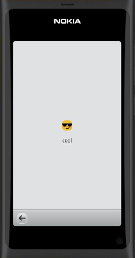
The IconPage.qml file displays the smiley icon image and the icon name. The image is placed inside an Item element to reserve some space around the icon. A back-button is placed into the toolbar to get back to the list view page.
import QtQuick 1.1
import com.nokia.meego 1.0

Page {
    Item {
        id: item
        anchors.centerIn: parent
        width: parent.width; height: 100
        Image {
            anchors.centerIn: parent
            source: "image://theme/"+iconPrefix+iconSelected
        }
    }
    Label {
        id:label
        anchors.top: item.bottom
        anchors.horizontalCenter: parent.horizontalCenter
        text: iconSelected
    }
    tools: ToolBarLayout {
        id: iconTools
        visible: true
        ToolIcon {
            platformIconId: "toolbar-back"
            anchors.left: parent.left
            onClicked: pageStack.pop()
        }
    }
}
Let’s compile the application and run it in the simulator. The list of icon names will be displayed. The list can be scrolled up and down. By clicking one of the names the corresponding icon page will be shown.
The application is available in GitHub and can be opened in QtCreator using the address:
https://github.com/n9dyfi/TestApp5.git