Color scheme tester
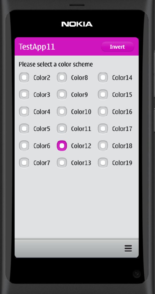
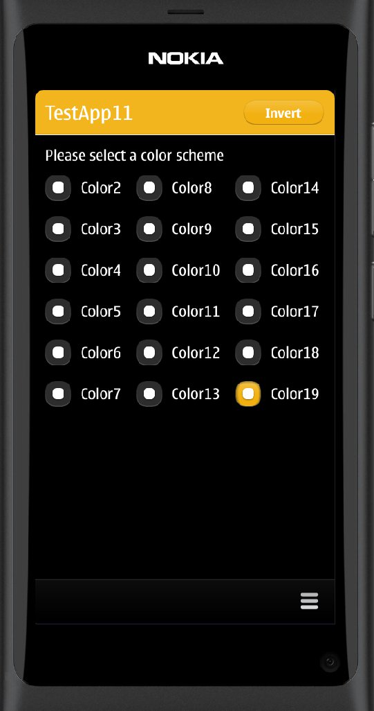
This example application demonstrates how the color scheme can be changed. In addition to the base theme there are a total of 18 different color themes available (numbered from 2 to 19). It is actually quite easy to change the theme, you just need to set the theme.colorScheme property in the QML code.
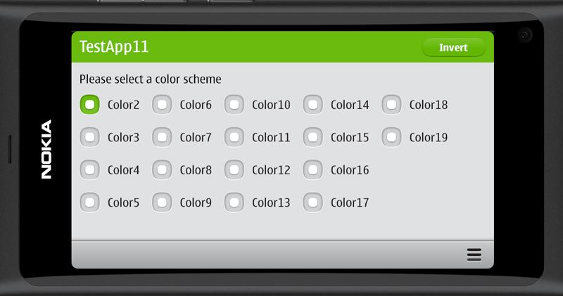
The application looks like shown below. This time I tried the build the user interface a bit more like the standard N9 applications. Basically this just requires that the page margins, header dimensions and font properties are set according to the N9 UI guidelines.
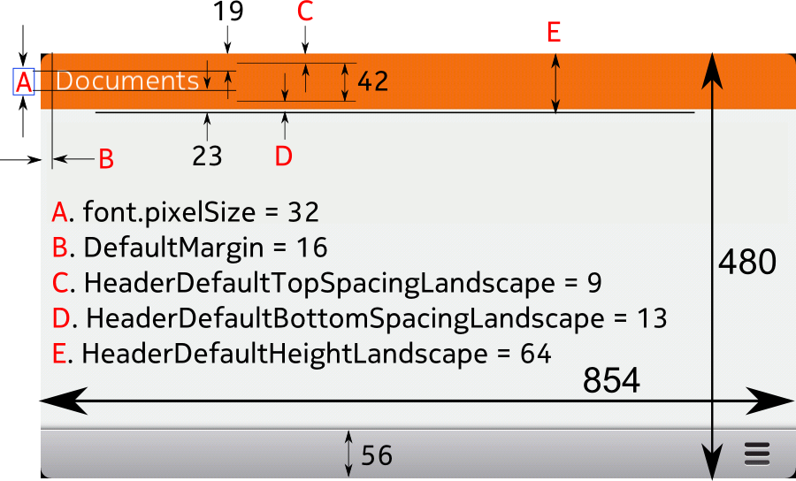
The view-header dimensions and text position depend on the screen orientation. I have annotated the relevant parameters into the following figures.

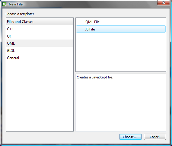
To make the parameter usage a bit easier I saved all the constants into a javascript library. I followed the UI constants naming conventions but adjusted the values a bit to get a better match with the standard N9 applications. The library can be created by selecting Add>New and then QML and JS File.
I’ll name the file appConstants.js. The file contents is shown below. Basically the file just assigns values to a set of javascript variables. The variable names become available in the QML file by using the import command.
// Application specific UI constants

.pragma library

var colorScheme = 2;

var DefaultMargin = 16;
var RadioButtonSpacing = 24;

var HeaderDefaultHeightPortrait = 72;
var HeaderDefaultTopSpacingPortrait = 15;
var HeaderDefaultBottomSpacingPortrait = 15;

var HeaderDefaultHeightLandscape = 64;
var HeaderDefaultTopSpacingLandscape = 9;
var HeaderDefaultBottomSpacingLandscape = 13;

var fontFamily = "Nokia Pure Text Light";
var fontSizeLarge = 32;
var fontSizeSmall = 24;
var fontFamilyButton = "Nokia Pure Text"
var fontSizeButton = 20;
Here is the main.qml file. Note the import command in the beginning of the file. After importing the appConstants.js the variables can be used directly or by assigning the variable values to properties. I will use properties to define the header dimensions as they depend on the orientation. I can use the onInPortraitChanged event handler to set the property values.
import QtQuick 1.1
import com.nokia.meego 1.0

import "appConstants.js" as AppConstants

PageStackWindow {

    id: appWindow

    // UI constants
    property int defaultMargin : AppConstants.DefaultMargin
    property int headerFontSize : AppConstants.fontSizeLarge
    property string headerFontFamily : AppConstants.fontFamily
    property string buttonFontFamily : AppConstants.fontFamilyButton
    property int buttonFontSize : AppConstants.fontSizeButton

    // UI variables (may change due to orientation change)
    property int headerHeight
    property int headerTopSpacing
    property int headerBottomSpacing
    property int nColumns
    property string promptFontColor : "black"

    showStatusBar: false
    initialPage: mainPage

    MainPage {
        id: mainPage
    }

    ToolBarLayout {
        id: commonTools
        visible: true
        ToolIcon {
            platformIconId: "toolbar-view-menu"
            anchors.right: (parent === undefined) ? undefined : parent.right
            onClicked: (myMenu.status === DialogStatus.Closed) ? myMenu.open() : myMenu.close()
        }
    }

    Menu {
        id: myMenu
        visualParent: pageStack
        MenuLayout {
            MenuItem { text: qsTr("Sample menu item") }
        }
    }

    // adjust orientation dependent variables
    onInPortraitChanged: {
        headerHeight =
                (inPortrait)?AppConstants.HeaderDefaultHeightPortrait:
                             AppConstants.HeaderDefaultHeightLandscape
        headerTopSpacing =
                (inPortrait)?AppConstants.HeaderDefaultTopSpacingPortrait:
                             AppConstants.HeaderDefaultTopSpacingLandscape
        headerBottomSpacing =
                (inPortrait)?AppConstants.HeaderDefaultBottomSpacingPortrait:
                             AppConstants.HeaderDefaultBottomSpacingLandscape
        nColumns = (inPortrait)?3:5
    }
}
The header is defined in the file Header.qml. The header depends on the main.qml properties that define the header dimensional parameters. The header text is set with the headerText property that will be defined when the header is instantiated in the MainPage.qml file.
The header and the header button images are loaded from the standard theme directory (image://theme) depending on the currently chosen color scheme (theme.colorScheme).
Note also the usage of the theme.inverted property (can be toggled with the Invert button).
import QtQuick 1.1
import com.nokia.meego 1.0

Item {

    property alias headerText: titleLabel.text
    property string buttonBackground: "image://theme/color"+theme.colorScheme+"-meegotouch-button-accent-background"
    property string viewHeader: "image://theme/color"+theme.colorScheme+"-meegotouch-view-header-fixed"

    // header dimensions
    height: headerHeight
    width: parent.width

    ButtonStyle {
        id: buttonStyle
        textColor: "white"
        fontFamily: buttonFontFamily
        fontPixelSize: buttonFontSize
        background: buttonBackground
        pressedBackground: buttonBackground+"-pressed"
    }
    LabelStyle {
        id: labelStyle
        textColor: "white"
        fontFamily: headerFontFamily
        fontPixelSize: headerFontSize
    }

    // Header background image
    Image {
        id: titleImage
        height: parent.height
        width: parent.width
        source: viewHeader
    }

    // Header text
    Label {
        id: titleLabel
        platformStyle: labelStyle
        anchors {
            top:parent.top; topMargin:headerTopSpacing;
            bottom:parent.bottom; bottomMargin:headerBottomSpacing;
            left:parent.left; leftMargin:defaultMargin
        }
    }

    // Theme invert button
    Button {
        id: titleButton
        width: 130
        height: 40
        anchors { right: titleImage.right; rightMargin: defaultMargin
                  verticalCenter: titleImage.verticalCenter}
        platformStyle: buttonStyle
        text: "Invert"
        onClicked: {
            theme.inverted=!theme.inverted
            promptFontColor=theme.inverted?"White":"Black"
        }
    }
}
The MainPage.qml file loads the Header component from Header.qml and sets the header text (“TestApp11”). The currentColor property is used to keep track of the currently chosen color scheme. The color selection is done with a set of radio buttons arranged inside a Grid component. Note that the number of columns in the grid is dynamically set based on the screen orientation (nColumns is set in main.qml).
import QtQuick 1.1
import com.nokia.meego 1.0

import "appConstants.js" as AppConstants

Page {

    property int currentColor : AppConstants.colorScheme

    tools: commonTools

    // the page header element
    Header {
        id: header
        headerText: "TestApp11"
    }

    // detect change in the currentColor property

    onCurrentColorChanged: {

        // apply the current color to the color scheme, header image and header button
        theme.colorScheme=currentColor

        // set the clicked button as checked
        radio2.checked = currentColor==2
        radio3.checked = currentColor==3
        radio4.checked = currentColor==4
        radio5.checked = currentColor==5
        radio6.checked = currentColor==6
        radio7.checked = currentColor==7
        radio8.checked = currentColor==8
        radio9.checked = currentColor==9
        radio10.checked = currentColor==10
        radio11.checked = currentColor==11
        radio12.checked = currentColor==12
        radio13.checked = currentColor==13
        radio14.checked = currentColor==14
        radio15.checked = currentColor==15
        radio16.checked = currentColor==16
        radio17.checked = currentColor==17
        radio18.checked = currentColor==18
        radio19.checked = currentColor==19
    }

    // the page contents
    Item {

        // anchor below header and use the default margins
        anchors {top: header.bottom;bottom: parent.bottom;
            left: parent.left; right: parent.right;
            leftMargin:defaultMargin;topMargin:defaultMargin}

        Text {
            id: prompt
            text: qsTr("Please select a color scheme")
            font.pixelSize: AppConstants.fontSizeSmall
            color: promptFontColor
        }

        // position the radio buttons using a grid layout

        Grid {

            columns: nColumns   // depends on orientation
            flow: Grid.TopToBottom
            spacing: AppConstants.RadioButtonSpacing
            anchors {top: prompt.bottom; topMargin: defaultMargin}

            RadioButton { id: radio2; text: "Color2"; onClicked: currentColor=2}
            RadioButton { id: radio3; text: "Color3"; onClicked: currentColor=3}
            RadioButton { id: radio4; text: "Color4"; onClicked: currentColor=4}
            RadioButton { id: radio5; text: "Color5"; onClicked: currentColor=5}
            RadioButton { id: radio6; text: "Color6"; onClicked: currentColor=6}
            RadioButton { id: radio7; text: "Color7"; onClicked: currentColor=7}
            RadioButton { id: radio8; text: "Color8"; onClicked: currentColor=8}
            RadioButton { id: radio9; text: "Color9"; onClicked: currentColor=9}
            RadioButton { id: radio10; text: "Color10"; onClicked: currentColor=10}
            RadioButton { id: radio11; text: "Color11"; onClicked: currentColor=11}
            RadioButton { id: radio12; text: "Color12"; onClicked: currentColor=12}
            RadioButton { id: radio13; text: "Color13"; onClicked: currentColor=13}
            RadioButton { id: radio14; text: "Color14"; onClicked: currentColor=14}
            RadioButton { id: radio15; text: "Color15"; onClicked: currentColor=15}
            RadioButton { id: radio16; text: "Color16"; onClicked: currentColor=16}
            RadioButton { id: radio17; text: "Color17"; onClicked: currentColor=17}
            RadioButton { id: radio18; text: "Color18"; onClicked: currentColor=18}
            RadioButton { id: radio19; text: "Color19"; onClicked: currentColor=19}
        }
    }
}
Let’s run the application in the simulator. When a color button is clicked the theme changes accordingly. And the invert button will invert the theme.