Smileys in the grid
Another useful view element is the GridView. The GridView element will display the model items in a cell grid. A typical GridView declaration is shown below:
    GridView {
        id: gridView
        model: gridModel
        delegate: gridDelegate
        cellHeight: 100
        cellWidth: 150
    }
We need to add two properties: cellHeight and cellWidth to define the cell size. Otherwise the usage is similar to the ListView element. We can also use the same model, e.g. a string list.
Let’s create a new application with GridView. Let’s take the smiley icon example from the previous post and replace the ListView element with GridView.
The main.qml file is basically the same as in the ListView app.
import QtQuick 1.1
import com.nokia.meego 1.0

PageStackWindow {
    id: appWindow

    property string iconPrefix: "icon-m-messaging-smiley-"
    property string iconNames: "angry;cool;cry;evil;grin;happy;heart;kiss;lips-sealed;sad;sarcastic;skeptical;sleepy;surprised;tongue;very-happy;wink;worried"
    property string iconSelected: "angry"

    initialPage: gridPage

    GridPage {
        id: gridPage
    }

    IconPage {
        id: iconPage
    }

    ToolBarLayout {
        id: commonTools
        visible: true
        ToolIcon {
            platformIconId: "toolbar-view-menu"
            anchors.right: (parent === undefined) ? undefined : parent.right
            onClicked: (myMenu.status === DialogStatus.Closed) ? myMenu.open() : myMenu.close()
        }
    }

    Menu {
        id: myMenu
        visualParent: pageStack
        MenuLayout {
            MenuItem { text: qsTr("Sample menu item") }
        }
    }
}
The GridView element is placed into the file GridPage.qml. The model and delegate properties are used in a same way as in the ListView element. The delegate component is a simple rectangle (with a gradient fill) containing the icon name. When the icon name is clicked the IconPage will be displayed.
import QtQuick 1.1
import com.nokia.meego 1.0

Page {

    tools: commonTools

    Label {
        id:title
        text: "Please select an icon"
        font.pixelSize: 40
        anchors.left: parent.left; anchors.leftMargin: leftMargin
    }

    Rectangle {
        id: background
        anchors.top: title.bottom
        height: parent.height-title.height;
        width: parent.width
    }

    GridView {
        id: listView
        model: iconNames.split(";")
        delegate: gridDelegate
        cellHeight: 100
        cellWidth: 150
        anchors.top: background.top
        anchors.topMargin: 20
        anchors.left: background.left
        anchors.leftMargin: 20
        width: background.width-30
        height: background.height-10
        clip: true
    }

    Component {
        id: gridDelegate
        Rectangle {
            width: 140
            height: 100
            gradient: Gradient {
                GradientStop { position: 0.0; color: "white"}
                GradientStop { position: 1.0; color: "gray"}
            }
            Text {
                text: modelData
                font.pixelSize: 28
                color: "steelblue"
                anchors.centerIn: parent
                MouseArea {
                    anchors.fill: parent
                    onClicked: {
                        iconSelected=modelData
                        pageStack.push(iconPage)
                    }
                }
            }

        }
    }
}
The IconPage is the same as in the ListView example.
import QtQuick 1.1
import com.nokia.meego 1.0

Page {
    Item {
        id: item
        anchors.centerIn: parent
        width: parent.width; height: 100
        Image {
            anchors.centerIn: parent
            source: "image://theme/"+iconPrefix+iconSelected
        }
    }
    Label {
        id:label
        anchors.top: item.bottom
        anchors.horizontalCenter: parent.horizontalCenter
        text: iconSelected
    }
    tools: ToolBarLayout {
        id: iconTools
        visible: true
        ToolIcon {
            platformIconId: "toolbar-back"
            anchors.left: parent.left
            onClicked: pageStack.pop()
        }
    }
}
If we compile and run the app the result should look like follows:
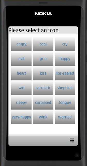
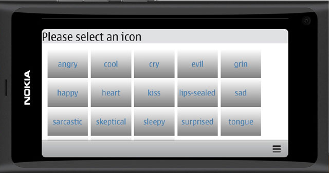
With our chosen cell size we will get a grid consisting of 3 columns in the portrait mode. In the landscape mode the grid will adjust automatically. All cells do not fit into the landscape display but the GridView can be scrolled just like the ListView.
Let’s save the example into GitHub as TestApp6. You can open the source code from the address:
https://github.com/n9dyfi/TestApp6.git