Application Basic View
Even though applications may appear in many formatting options (e.g. lists, grids, full screen mode, etc.), most views follow a basic structure.
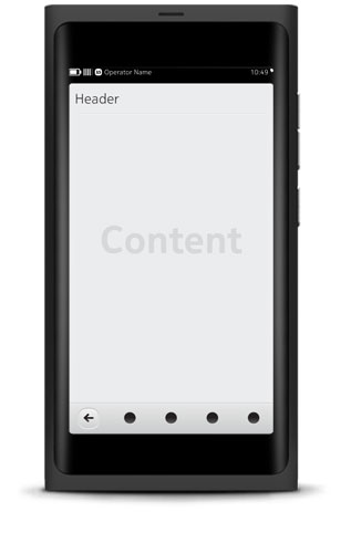
Status Bar and Notification banners
The main use of the Status Bar is to show signal strength, time and battery life (operator optional). In addition, it supports access to the Settings Shortcuts menu. The Status Bar is a required element for all views except full screen views. As an event is received or triggered, a Notification banner is displayed in place of the Status Bar.
Header Bar
The Header Bar is an optional bar at the top of the screen.
Content area
This is where most of the action happens and the layout gets dynamic. Aside from the main navigational components described below, other types of actions such as media controls and buttons can be presented together with the main content in the view.
The main navigational components are:
- Toolbar - An optional bar at the bottom of the screen available to applications that require either a Back button, Action Menu button, core commands, or all of the above.
- Tab Bar - An optional bar at the bottom or top of the screen that can contain up to five navigation options.