Saving & Confirmation
Two general options exist when it comes to providing a way for a user to confirm an action: automatically and manually.
Automatically
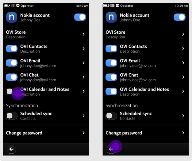
With this option, the requirement to save is implicit and therefore does not need to be confirmed with an additional interaction.
How this option works
Since the user is not required to execute a confirmation action, you do not need to provide "Save", "Confirm" or similar buttons. When the user taps the Back button to move away from the screen, any changes he or she has made should be saved automatically.
When to use this option
This option works best when changes require a simple set of actions that can be easily reversed. An example of this would be an "in-and-out" type of flow where the user goes in to the application to make a simple change and then naturally uses the Back button to return to the previous view. Do not use this option for complex, multi-step editing processes.
Some examples where automatic confirmation works well:
- Selecting/deselecting Pickers (search filters, recipients in a contact list, etc.)
- Modifying Settings
Manually
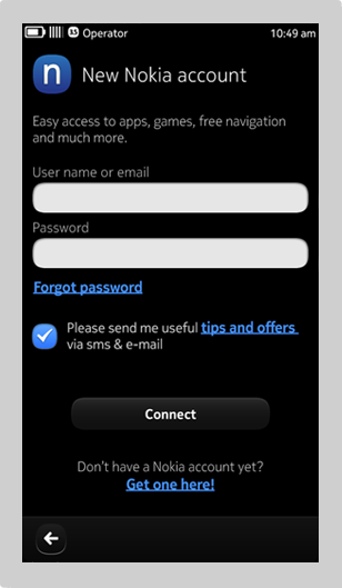
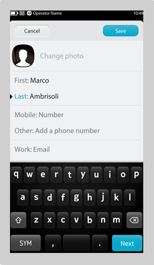
The second option is to provide a very explicit means of confirming or cancelling, i.e. with a "Save" or "Cancel" button. A Back button is unavailable in this option, since the user is required to provide a confirmation.
How this option works
With this option, a button such as "Save", "Confirm", "Delete", etc. is provided. Selecting one of these buttons confirms the user's action, completes the process, and takes the user to a new view. A "Cancel" button is also available that should return the user to the previous view.
When to use this option
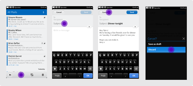
We recommend using this option in complex editing situations, i.e. when an action cannot be easily reversed. For example, when composing an email, the user is presented with "Send" and "Cancel" buttons. When cropping an image, "Crop" and "Cancel" buttons are available.
If an action steps the user forward through a set of actions, a manual confirmation should be used. Other examples:
- Sharing a picture
- Editing a video
Additional considerations
When using text buttons, consider their active and inactive states. In the options above, the confirming action should only become active once the user has made an edit or change. A "Cancel" button should always be accessible to return the user to the previous view.
Query confirmation
Consider providing a prompt for irreversible or time-consuming tasks. While lightweight actions do not impose a huge problem if changes are lost (e.g. dismissing a modification in the image editor), for more time-consuming actions, such as composing an email, it may be wise to offer a "Save as Draft" option.


