Sheets
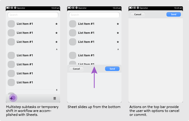
The sheet is a self-contained full screen view that slides up from the bottom of the screen. It is used to interrupt the application's main workflow temporarily and gather or display some key information immediately. A sheet is especially appropriate for isolating a potentially complex or multistep sub-task.
Use a sheet when you want to...
- Lead a user through a task such as composing an email or calendar event; viewing an image; or editing text fields. Complete tasks in step-by-step wizard for ease and clarity.
- Display content temporarily and offer some basic options for it. For example, you may want to display an image attached to an email, which the user can 'dismiss' or 'save'.
- Change work mode or context temporarily. For example, you may want to let users open a browser view after clicking on a URL.
A sheet is not used when...
A task is very simple and requires just one tap (e.g. selecting a value from a short list of options). Use a simple list or dialogue instead.
Order of options
In general, positive options appear right / top, while negative options appear left / bottom. Also, we recommend that the Sheet presents its options in the following order:
- Primary actions (e.g. Call, View, Play)
- Secondary actions (e.g. Send Message, Set as Wallpaper)
- When relevant, Share
- Negative actions (e.g. Delete, Remove, Unsubscribe)
Guidelines & Flow
Guidelines for Sheets
A sheet always slides up from the bottom. Depending on the application's needs, it may or may not cover the status bar. Once the user has dismissed the sheet, it slides down again. The sheet never has a tool bar on the bottom.
A sheet always displays a button bar on top, holding at least one button. The buttons use text strings and not icons and should always provide an obvious and safe way to exit the sheet. In most cases, the button bar has a negative and positive action. In general, for the negative action, 'Cancel' is used, and for the positive action, the actual verb is used (e.g. 'Next', 'Send' or 'Connect'). 'Back' is discouraged to prevent conveying the association of a hierarchical relationship between the sheet and the previous state or screen.
Where possible, a sheet should continue to rely on the default behaviour of simple controls such as combo-box dialogues and switches.
Let the sheet flow
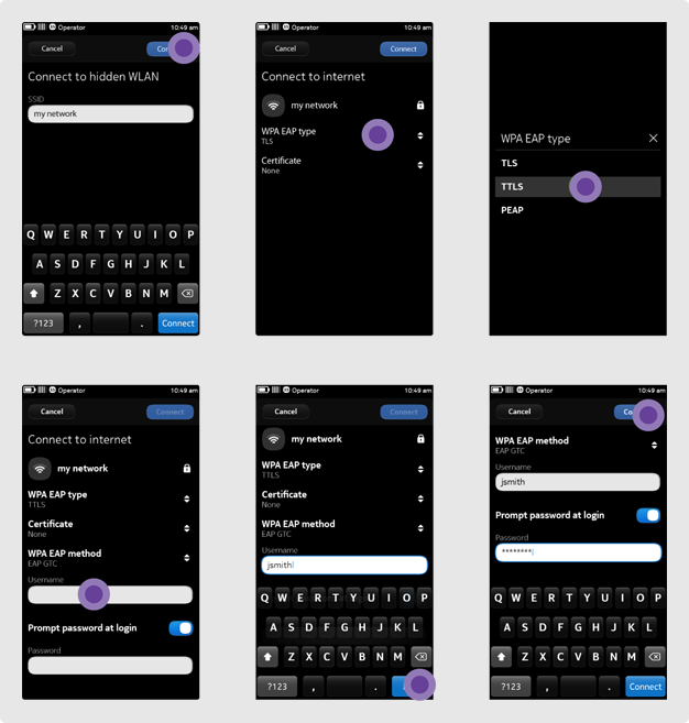
In some instances (e.g. adding a new contact), it may be useful to have the sheet set the focus to the first text field and open the keyboard automatically. However, if the user is editing an existing contact, there is no way to know which field the user will want to edit, therefore the focus should not be set automatically. We recommend considering the context of use carefully before using this functionality.
Always make sure the visual hierarchy of the screen guides the user through a natural order of the controls. The blue key in the bottom right corner of the keyboard reads 'Next'. At the end of a sequence, a confirming label (e.g. 'Save' or 'Done' ) will close the keyboard.
A sheet never spawns more than one additional sheet. Designs that require a second sheet should be reconsidered and ones requiring a third require a complete redesign. However, in very specific cases, the sheet could spawn a query dialogue (e.g. closing a sheet could spawn a "Save as draft? or Save / Discard" dialogue).
Composers
Composers as Sheets
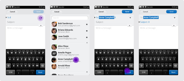
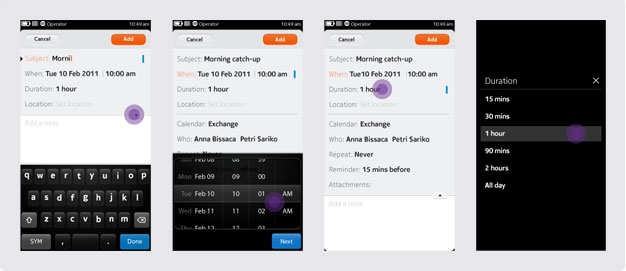
A composer is typically implemented as a sheet, e.g. for composing an email, SMS message or calendar event. If your application includes a composer as well, consider the following guidelines:
- Aside from using the default pickers where possible, also use the default person or content pickers. This will allow users to select recipients of an email, for example, or to specify files for attachment to a calendar event. In such cases, a second sheet can be spawned.
- Consider hiding some input fields that are either not mandatory or typically don't need to be changed (e.g. 'Repeat' and 'Reminder' in example 2).
- Activate the primary action button - typically at the top right of the sheet (e.g. Send) - only when the required information is entered.
Note on transitions
The default transition of a closing a sheet is 'slide down'. However, when creating a new object using a composer, consider using a 'slide right' transition to the container holding the new object (e.g. show the day view of the calendar displaying a new calendar event).
Language for Sheets
The active buttons confirm or cancel the details a user has already added to a list (e.g. name, password, date). As such, they need to be clear and concise — so use just one word wherever possible. Usually, there is a choice of two opposites: 'Save-Cancel', 'Add-Cancel', 'Connect-Cancel'. Wherever possible, use a relevant one-word action name.
Use: Share
Use: Add
Use: Connect
Alternative: Cancel
If a user has just input some information (e.g. creating a new contact or editing a photo), the button text should be 'Save'. However, if the user's mobile has just completed a download or sync, the button text should be 'Done'. If the user wanted to stop the process, he or she could tap 'Cancel'. Never use the combination of 'Done-Save' together. Buttons can also sometimes appear on their own. For example: